INT Control
- Project
- Concept prototype
- OS
- Android · iOS
A mobile app for recording in the field the steps set out in the Standardized Work Instructions (INT) for each firefighting intervention. Users select the intervention type, check off the mandatory actions, access support information and, once finished, generate a summary that can be exported as a PDF. This is a design proposal developed up to the prototype stage, and it has not been released to market.
In every intervention, incident commanders must follow the steps set out in the corresponding INT for each type of incident: from the first actions to the final handover, including specific procedures such as flash reports or ventilation. Until now, this was tracked through a tool linked to a Telegram channel, which was impractical in the field, or simply with pen and paper. This made it hard to keep a clear overview of what had been done and what was still pending, and to keep a record once the call was over.
A mobile app that turns each protocol into a guided checklist. Users select one of the six intervention types and check off actions as the call progresses, with direct access to reference sheets whenever in doubt. During the process, the initial split by role (crew commander and incident commander) was dropped, since the same person may end up handling every phase of the call. Once finished, the app generates a report with the action count and basic data, which can be exported as a PDF and consulted later from the archive.
UX RESEARCH
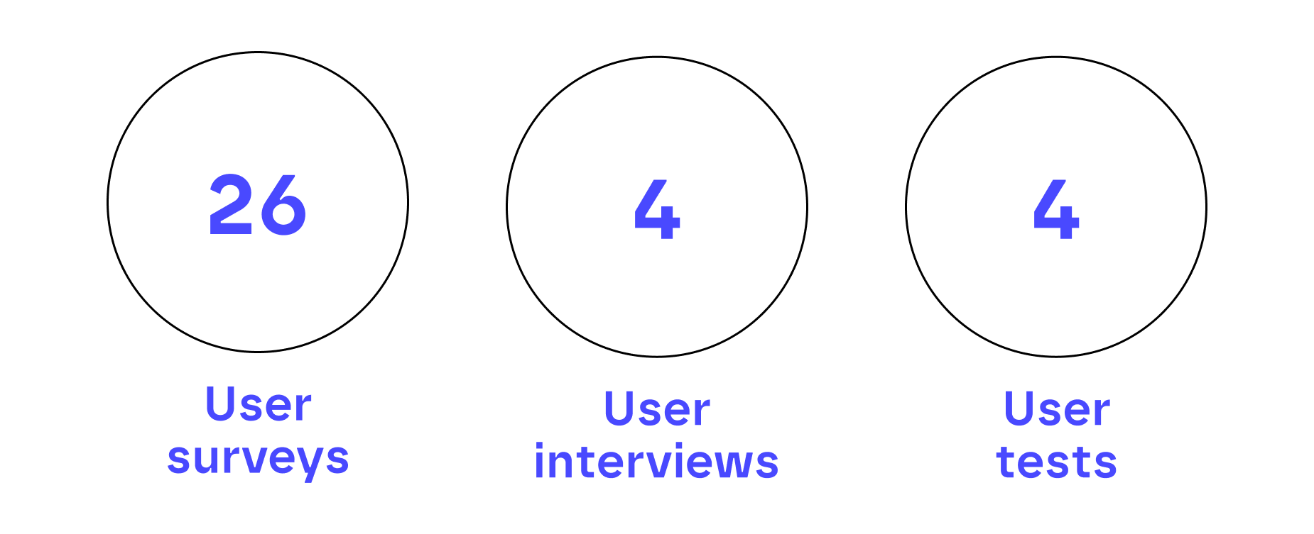
Before starting any visual design work, a short research phase based on surveys and interviews with members of the fire service was carried out to validate the real need for a digital tool. Later, once the first basic prototypes were ready, user tests were conducted to gather feedback and iterate on the solution.
ARCHITECTURE
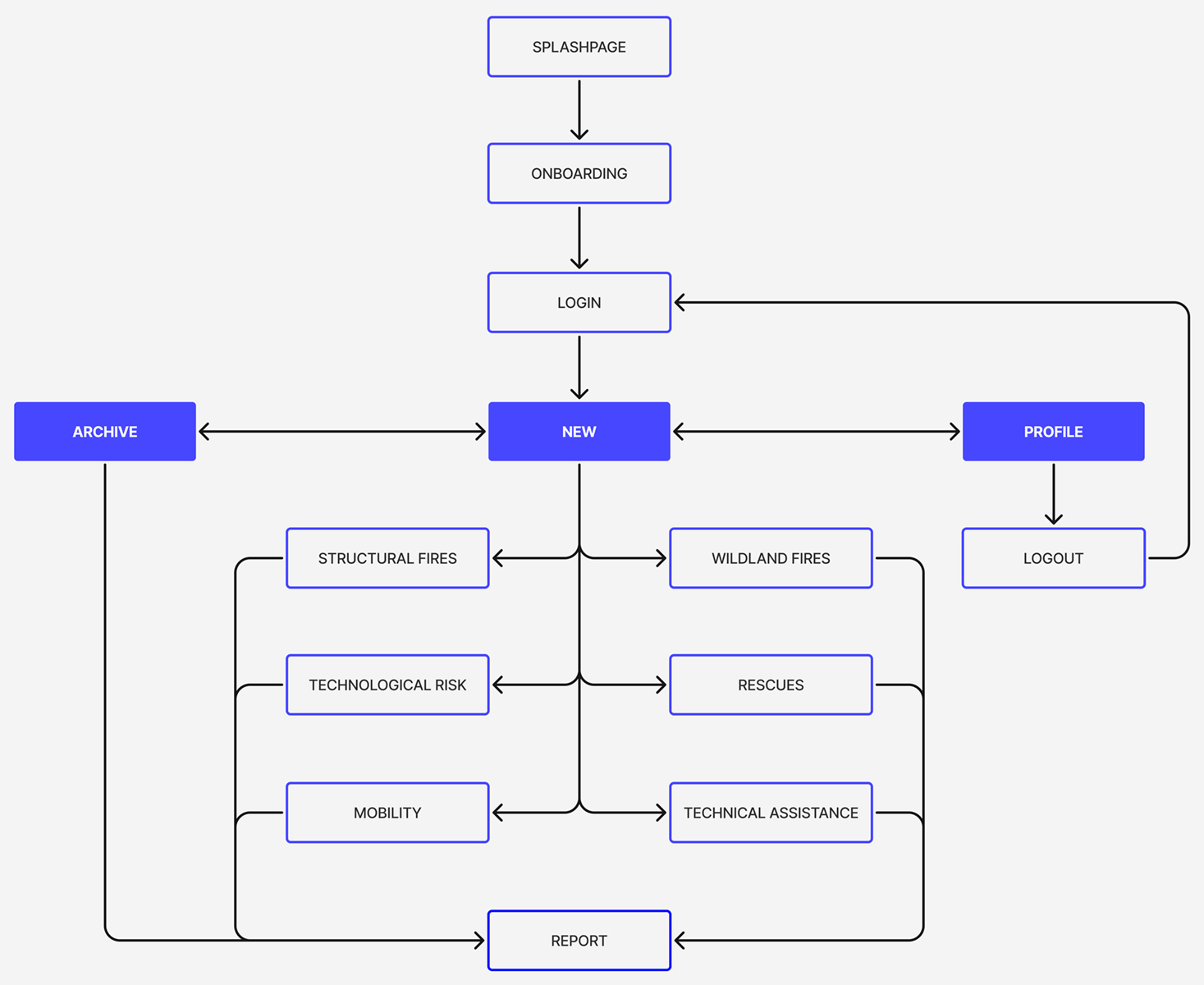
The information architecture is built around three main sections, accessible from the bottom navigation bar: New, Archive and Profile. New acts as the entry point, where users select one of the six intervention types and follow the corresponding protocol through to the final report. The same report can be consulted again at any time from the Archive.
WIREFRAMES
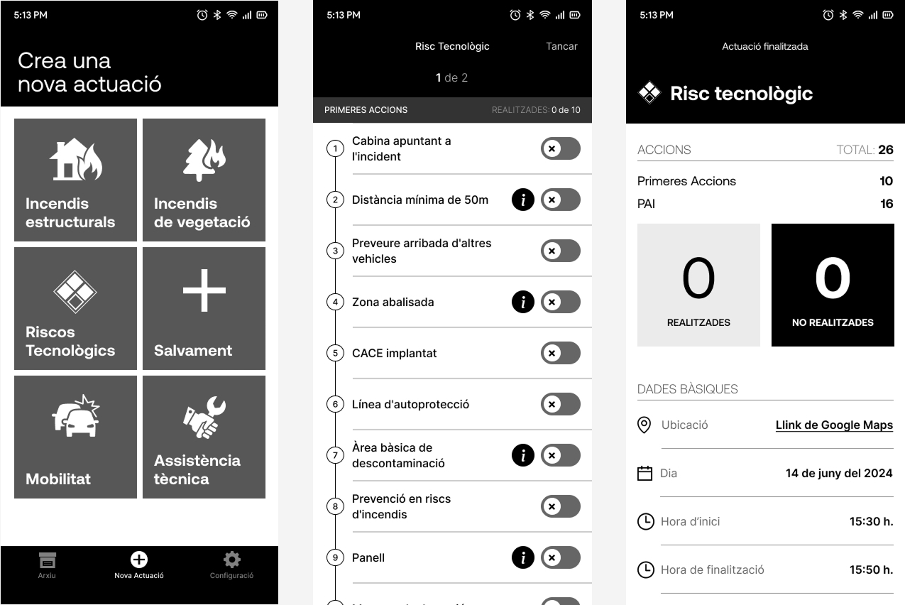
Before moving on to the visual design, mid-fidelity prototypes were built to validate the structure with real users. Testing helped uncover confusing flows, unnecessary steps and unclear interactions, and the solution was iterated to create a more direct and reliable experience in the field.
DIGITAL
PRODUCT
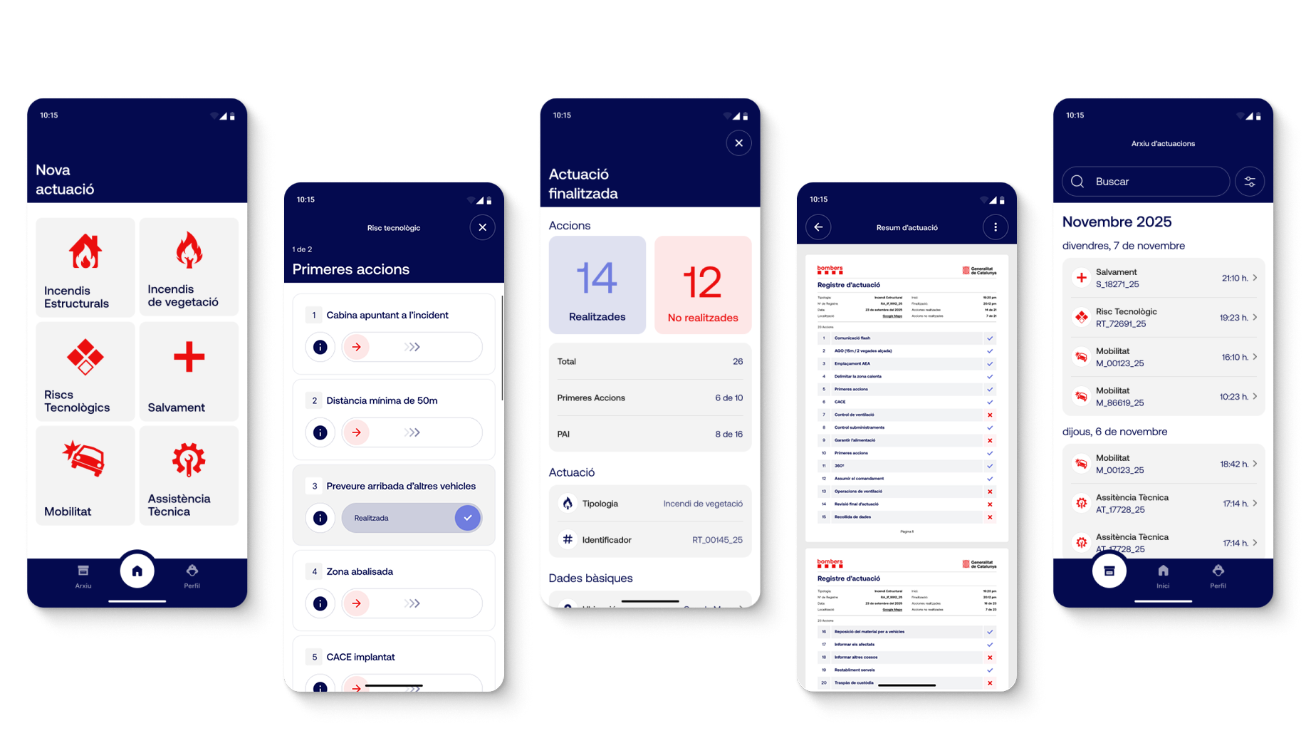
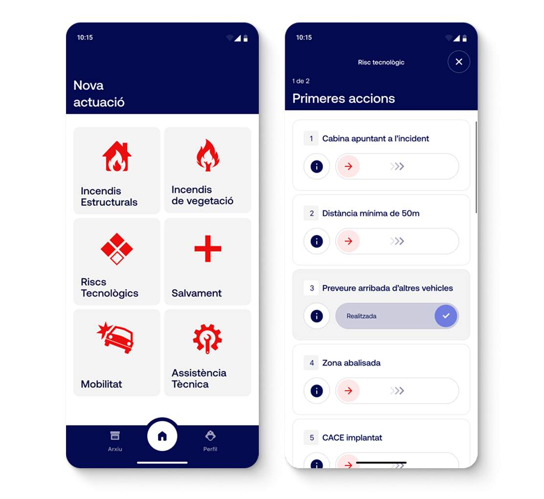
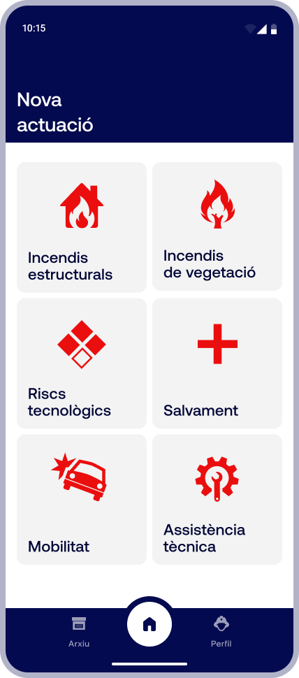
After logging in, users land directly on the screen for creating a new intervention. The six intervention types are laid out in a grid of large cards, each with its own icon, so they can be recognized at a glance and selected with a single tap, even under pressure in the field.
ACTIONS
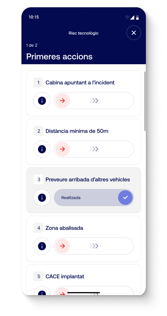
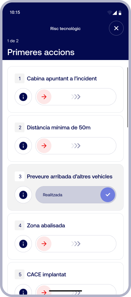
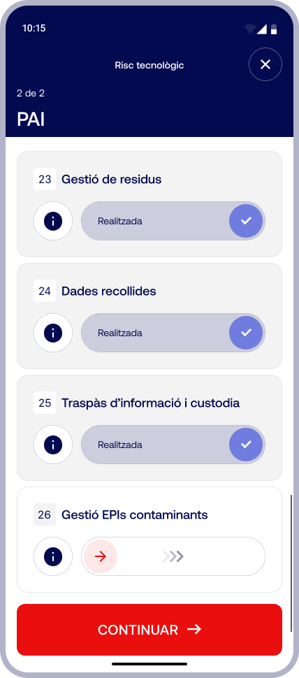
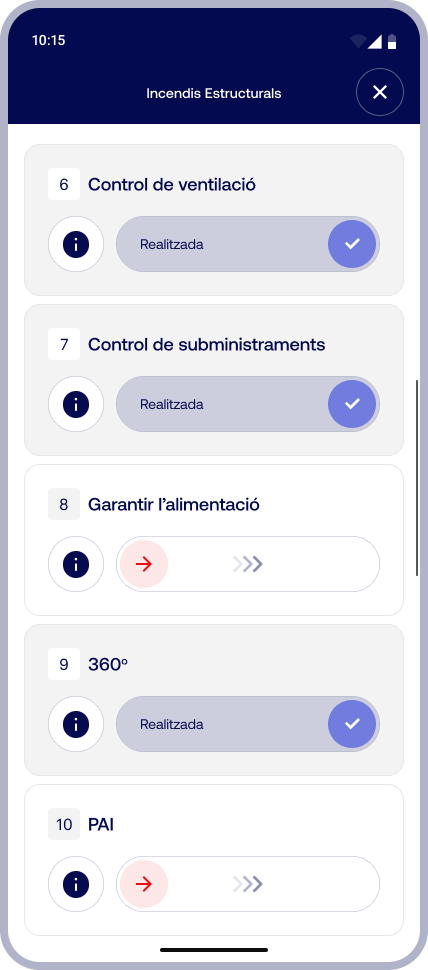
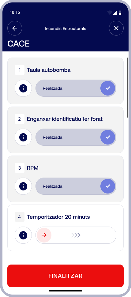
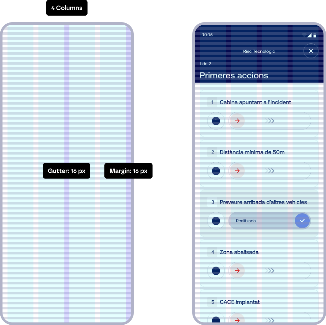
Each protocol is presented as a numbered list of actions, in the order they are carried out. The key component is the slide-to-confirm control: marking an action as completed requires a deliberate swipe, which prevents accidental confirmations. Once completed, the card changes state and color, so users can see at a glance what has been done and what is still pending. Each step also includes an info button to resolve any doubts.
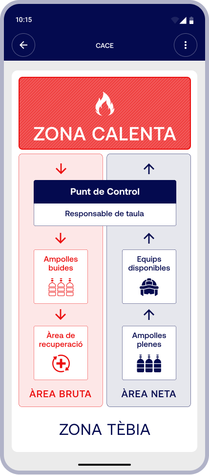
Some protocol steps are easier to understand through a diagram than through text. For this reason, the app includes quick-reference infographics, such as area layouts or crew circuits. A simple color code and a clear hierarchy make them readable at a glance, even under pressure.
REPORT
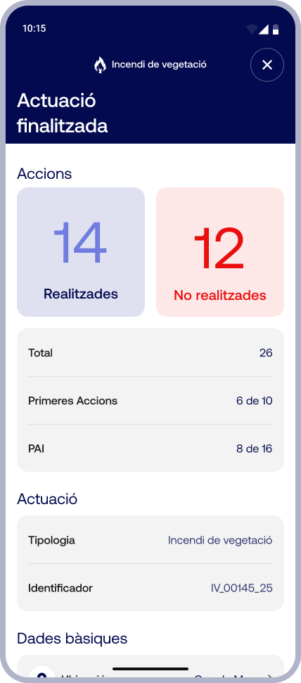
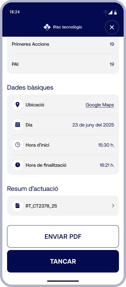
Once the intervention is finished, the app generates a report with the count of completed and pending actions, broken down by phase. It also includes the basic call data (location, date, start and end times), and the report can be sent as a PDF and is stored in the archive.
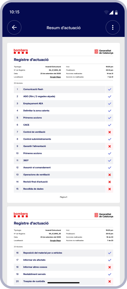
The report can also be exported as a PDF to be shared or filed outside the app. The document brings together the intervention details and the full list of actions, showing the status of each one in a clean, easy-to-review format.
ARCHIVE
& PROFILE
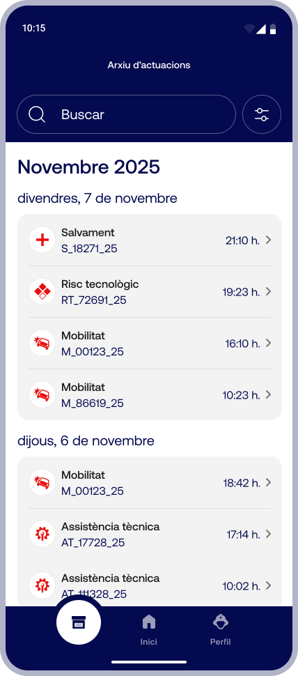
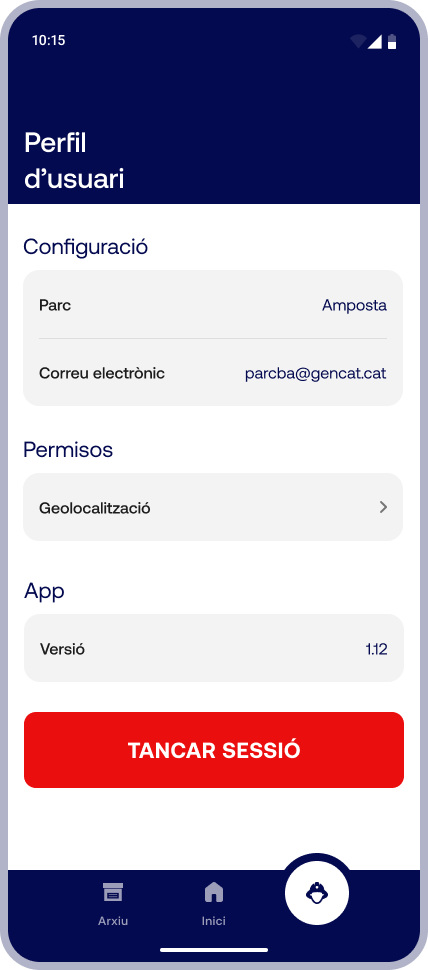
From the Archive, users can consult past interventions, grouped by date and identified by type and code, with search and filters. The Profile brings together the basic settings: assigned fire station, permissions and log out.
UI GUIDELINES